
UX Fundamentals for Frontend Engineers — Part 1
Part 1 of a crash course on UX fundamentals for frontend engineers — covering research methods, Nielsen's heuristics, Gestalt principles, and emotional design. UI trends, typography, and accessibility coming (Part 2).
Everyone talks about user experience. Nobody talks about developer experience. Fair enough — but here's the thing: you can't genuinely care about one without understanding the other. This post is my attempt to give you, as a developer, a solid enough foundation in UX that you actually want to care about the user's side too — not because a designer told you to, but because you get it.
You write the code that users actually touch. Every button you render, every loading state you skip, every error message you leave as Something went wrong — that's a UX decision, whether you made it consciously or not.
This is Part 1 of a crash course on UX fundamentals for frontend engineers — no design background required.
Agenda
Part 1 (this post)
- Research 101
- Nielsen's 10 Heuristics
- System 1 vs. System 2
- Design for Humans, Not Users
- Gestalt Principles
- Emotional Design
Part 2 (coming soon)
- UI Trends
- Layout & Typography
- Accessibility 101
1. Research 101
Here's something most engineers skip: before anyone draws a single screen, good design starts with actually understanding people. Not assuming. Not guessing. Understanding.
Quantitative vs. Qualitative
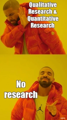
There are two ways to do that, and they answer very different questions.
| Quantitative | Qualitative | |
|---|---|---|
| Sample size | Large | Small |
| Output | Numerical data | Stories & insights |
| Methods | Surveys, A/B testing | Interviews, diary studies, usability testing, card sorting |
| Cost | Cheaper to run at scale | More expensive per participant |
Think of it this way: quantitative tells you what is broken. Qualitative tells you why it's broken. You need both.
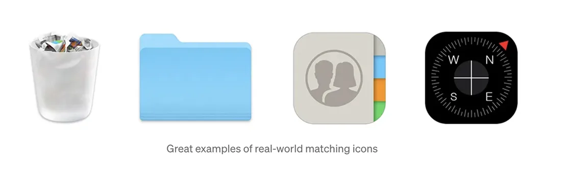
Primary vs. Secondary Research
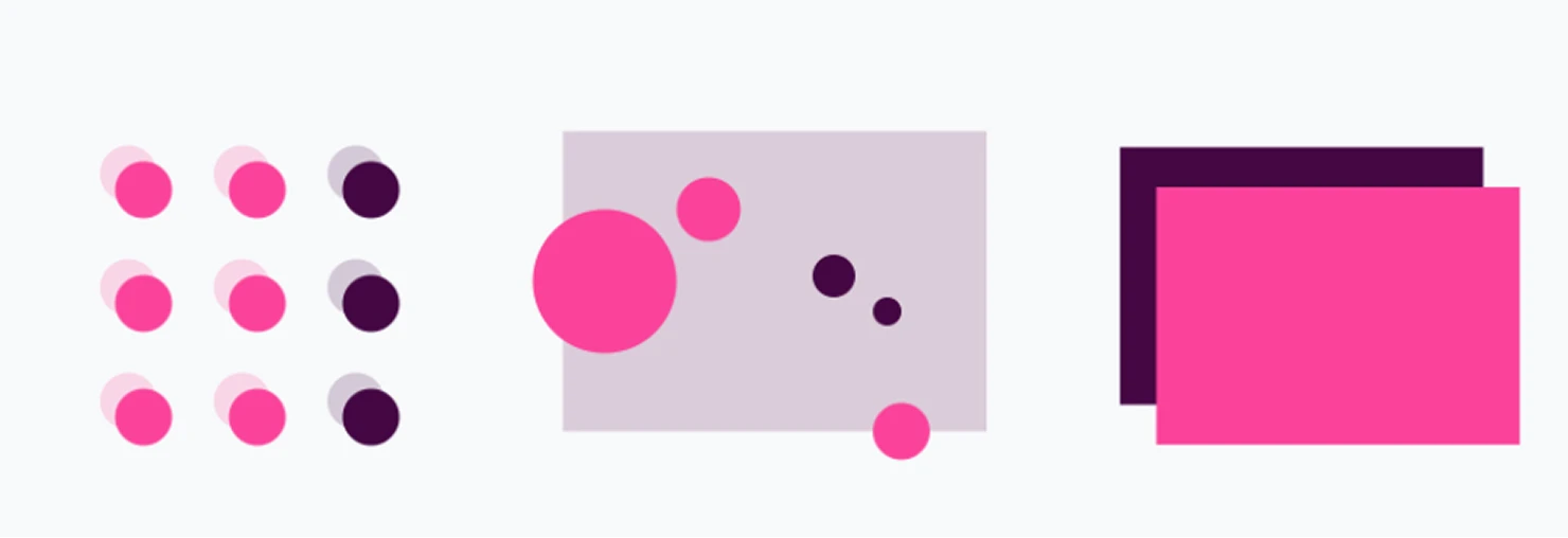
Now you're familiar with the difference between qualitative and quantitative research. Before getting into design and visuals, good research also means knowing where your data comes from — whether it's data you already have about your product and users, or data you need to collect yourself because there are gaps to fill.
There's also a difference in where you get your information from.
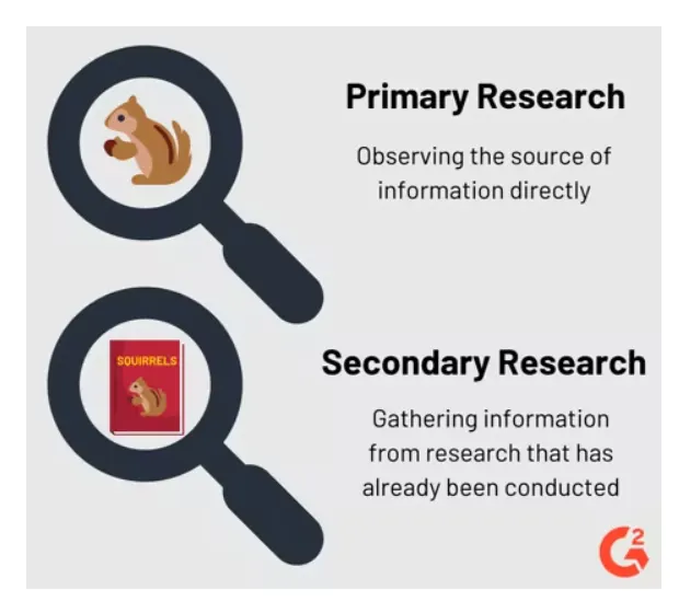
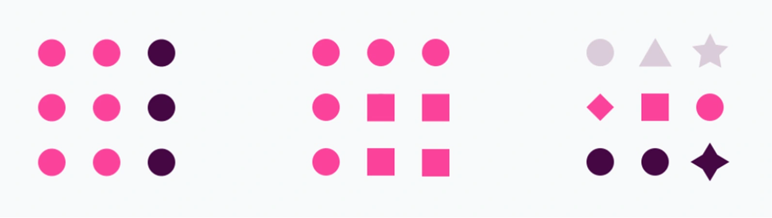
From the image above, we can notice that the squirrel (representing our users) is observed directly in primary research, while in secondary research we get data from different resources like books.
Primary research means going directly to real users — messy, slow, but irreplaceable:
- Interviews (Qualitative)
- Surveys (Quantitative)
Secondary research means learning from what already exists — faster, but it's someone else's context:
- Relevant books, articles, case studies, and magazines
- Your company's internal data and analytics
- Industry statistics and benchmarks
In practice, I'd start with secondary to get up to speed fast, then use primary to check if any of it actually applies to the people you're building for. Don't skip either.
This is just the surface of what research involves — there's a lot more depth to this step, which is exactly why the role of UX Researcher exists. It's a dedicated role focused entirely on understanding users before a single design decision is made.
2. Nielsen's 10 Heuristics
Jakob Nielsen came up with these back in 1994, and honestly? They've held up better than most things from that era. They're not rigid rules — more like a checklist you keep in the back of your head. When something feels off in a UI, one of these is usually why.
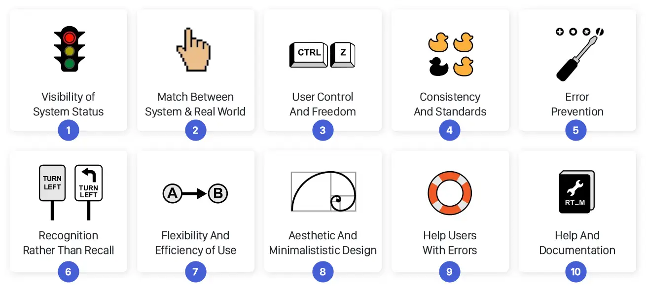
1. Visibility of System Status
Tell people what's happening. That's it. Sounds basic, but I can't count how many times I've clicked a button and just... nothing. No spinner, no confirmation, no sign of life. Was it working? Did I miss? Do I click again? A loading state isn't a nice-to-have — it's the minimum courtesy you owe someone who just trusted your interface.
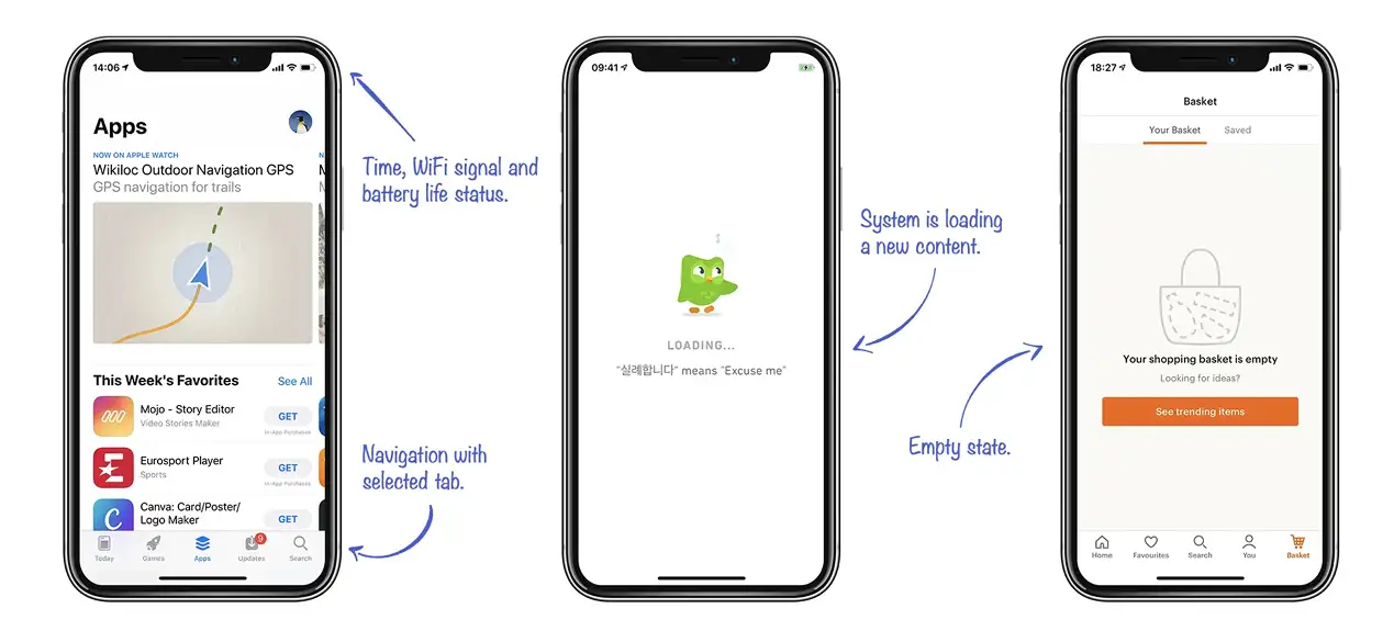
2. Match Between the System and the Real World
Talk like a person, not like a database schema. Your backend might call it a user_record, but the person filling out the form doesn't know that — and they shouldn't have to. Use the words they'd use. If they'd call it a "booking," don't call it a "reservation entity." Internal naming that leaks into the UI is one of the most reliable ways to make smart people feel dumb.
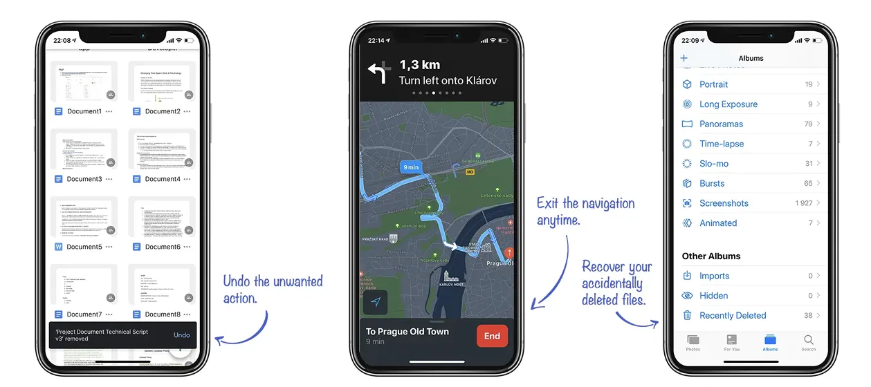
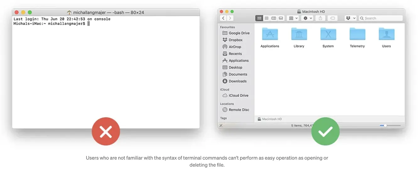
3. User Control and Freedom
People click the wrong thing. Always have, always will. The question is: can they get back? Every flow needs an easy exit — undo, cancel, go back, close. The second someone feels stuck, they stop trusting your app. Give them a way out, and make it obvious.
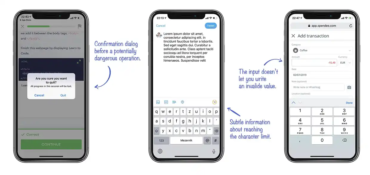
4. Error Prevention
The best error message is one that never has to show up. If you can grey out a button, add a confirmation step, or constrain an input so the wrong thing can't even be entered — do that instead. Preventing a mistake is always better than handling it gracefully after the fact.
5. Recognition Rather Than Recall
Don't make people remember things. If someone has to recall what they picked three screens ago just to finish what they're doing now, that's on us. Keep relevant context visible. Use autocomplete, breadcrumbs, previews. Let the interface remember so the person doesn't have to.
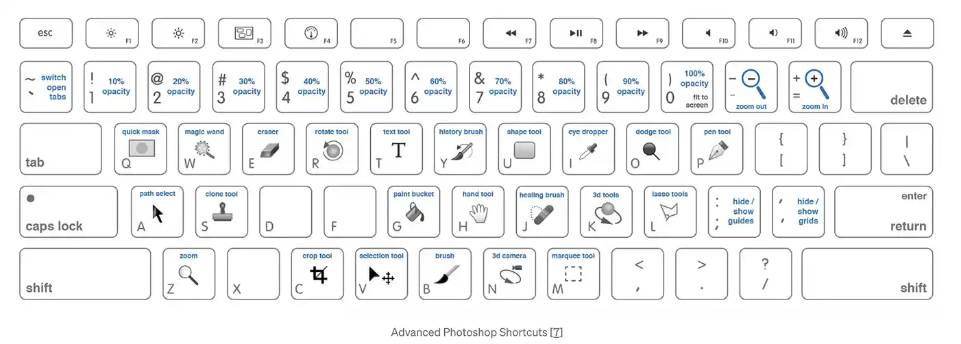
6. Flexibility and Efficiency of Use
A first-time user and a daily power user need very different things from the same interface. Keyboard shortcuts and quick actions shouldn't confuse beginners — but they should be there for the people who want them. Think of it as building two lanes on the same road: a gentle one for getting started, and a faster one for when people know where they're going.
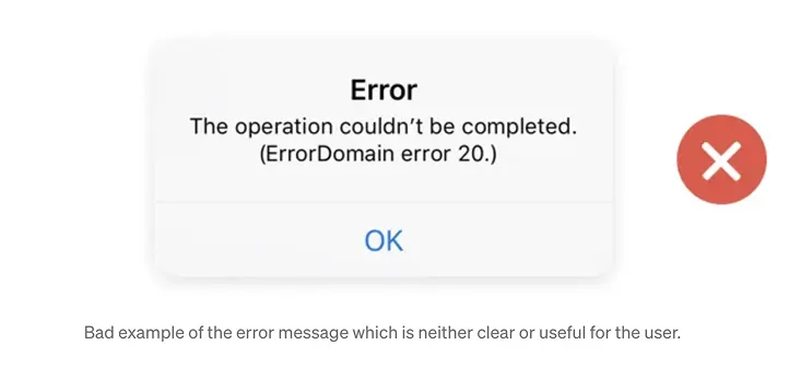
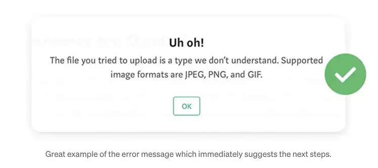
7. Help Users Recognize, Diagnose, and Recover From Errors
Error 403 is not a message. It's a shrug. When something breaks, say what broke and what they can do about it. You don't have access to this page — contact your admin to request permission is so much better. Error messages are the one moment where the interface has a real conversation with the user. Make it count.
3. System 1 vs. System 2
We Make Decisions Unconsciously
Here's the uncomfortable truth: most of what people perceive and decide about your interface happens before they're even consciously aware of it. People don't read interfaces. They scan, pattern-match, and react in milliseconds. By the time someone forms a coherent opinion about your product, their gut already made the call.
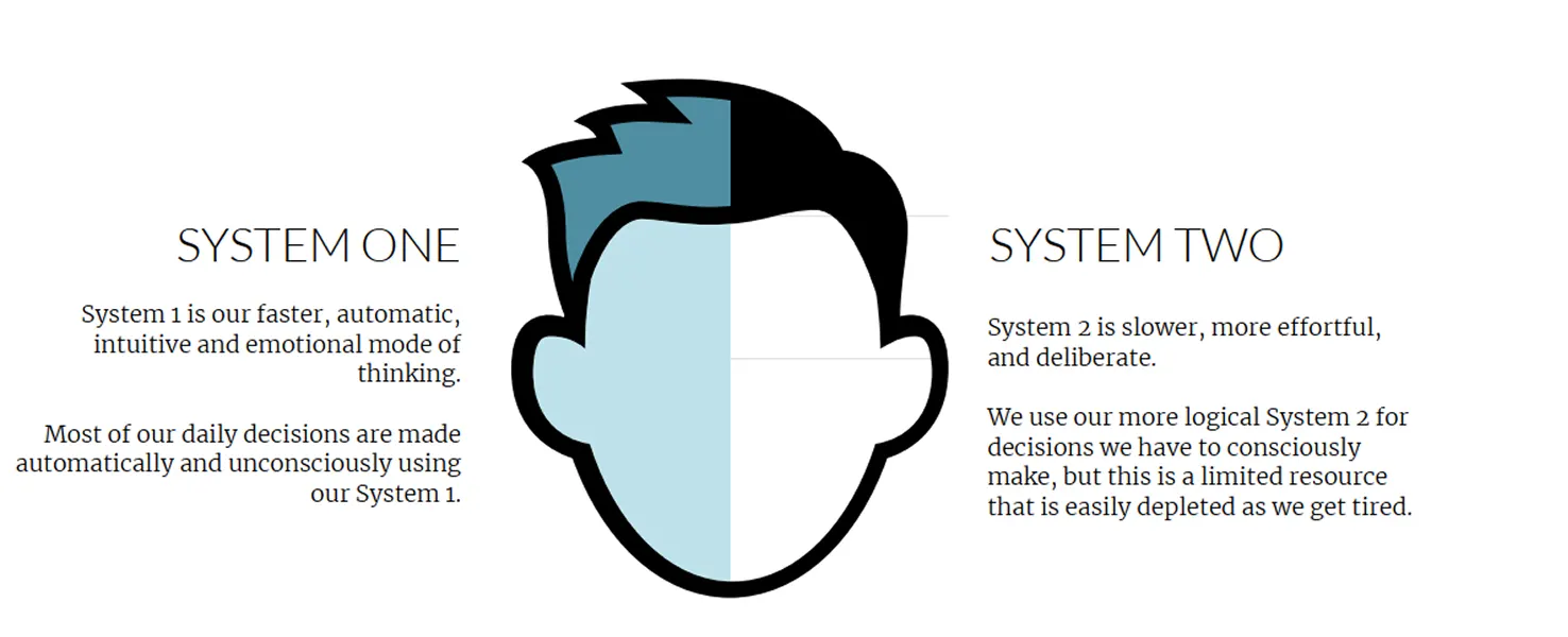
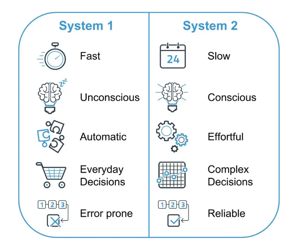
Cognitive scientists describe two modes of thinking:
- System 1 — Fast, automatic, emotional, effortless. This is the brain on autopilot. It's running almost all the time.
- System 2 — Slow, deliberate, logical, effortful. This is deep thinking. It costs energy and people resist using it.
System 1 wins. Almost every time. Your users are not going to engage System 2 to figure out your interface — they'll just leave. The job of a good UI is to make the right action feel obvious without requiring any conscious effort. Familiar patterns, clear hierarchy, no surprises.
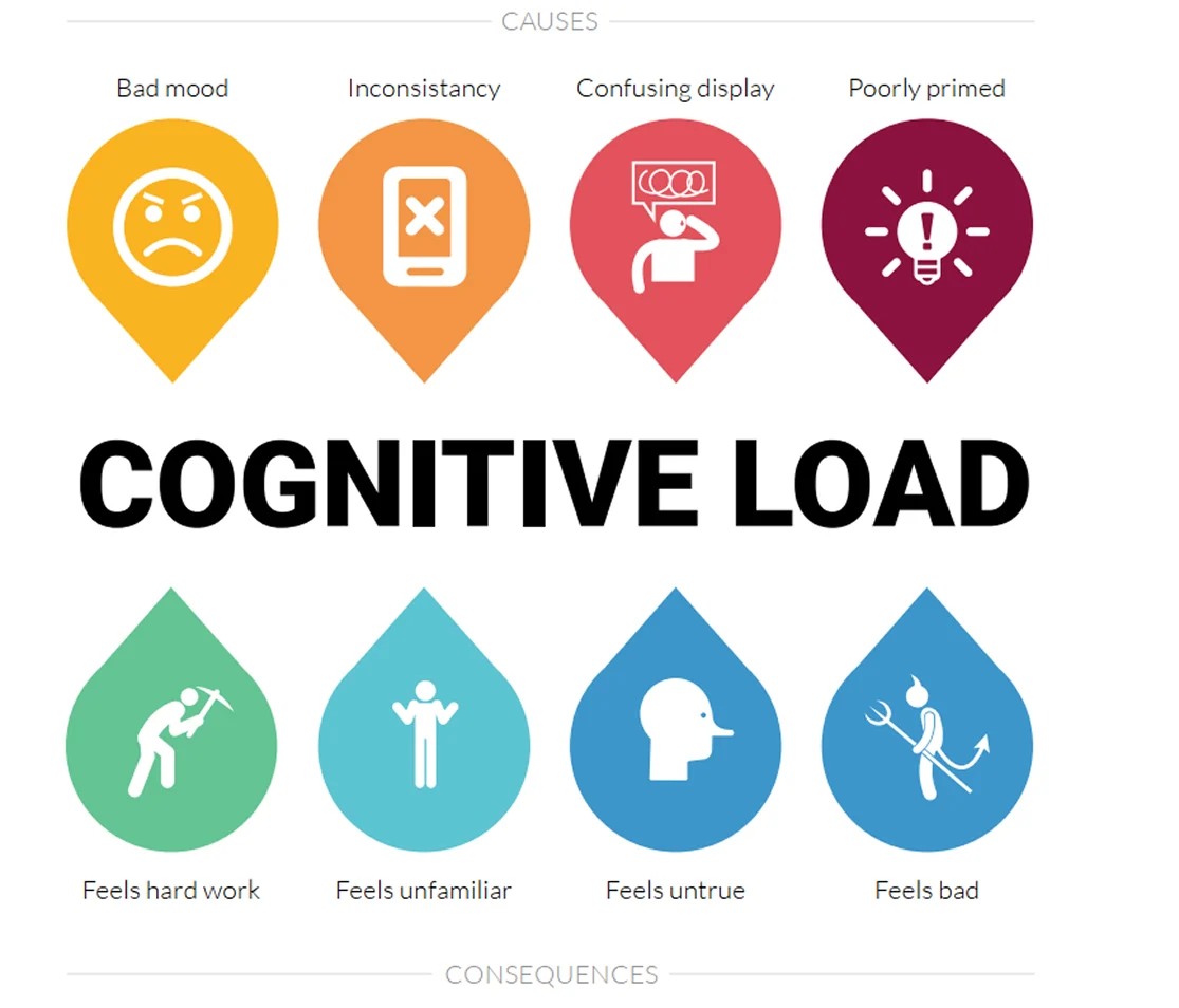
Everything listed here — too many choices, bad mood, inconsistency — are things that cause cognitive overload. And cognitive overload is exactly what activates System 2. That's what we want to avoid. The moment someone has to stop and think hard about your interface, you've already lost them.
4. Design for Humans, Not Users
I want to push back on the word "user" for a second. It's a weirdly clinical term for a human being. It flattens people into a role — someone who "uses" a thing — and strips away everything that makes them real: their emotions, their habits, their irrationality, their shortcuts. Here's what cognitive science actually tells us about how people behave.
Thinking is Hard — So Don't Make It Harder
Cognitive load is real and it stacks up fast. Every extra option, every unclear label, every unnecessary step adds friction — and friction kills completion. Two things help a lot:
Simplify relentlessly. Ask yourself: does this element, this step, this choice need to exist? If the answer isn't a confident yes, remove it. Simplicity isn't laziness — it's one of the hardest things to get right.
Limit options or chunk them. Hick's Law says the more choices you give someone, the longer it takes to decide — and the more likely they are to give up. Miller's Law says people can hold roughly 7 ± 2 things in working memory at once. A simple example: a 16-digit credit card number is overwhelming as one block, but split it into four groups of four and it's suddenly manageable. Same digits, same length — just chunked. That's the principle at work.
Peripheral Vision
Here's something I find genuinely fascinating: people don't look at everything on a screen. They fixate on a few things and perceive the rest through peripheral vision. That periphery still shapes how they feel about what they're looking at — it sets context, tone, and trust — even though it's never directly focused on.
This is why visual hierarchy and whitespace matter so much. They're not just aesthetic choices. They're controlling what gets perceived even when it's not being looked at.
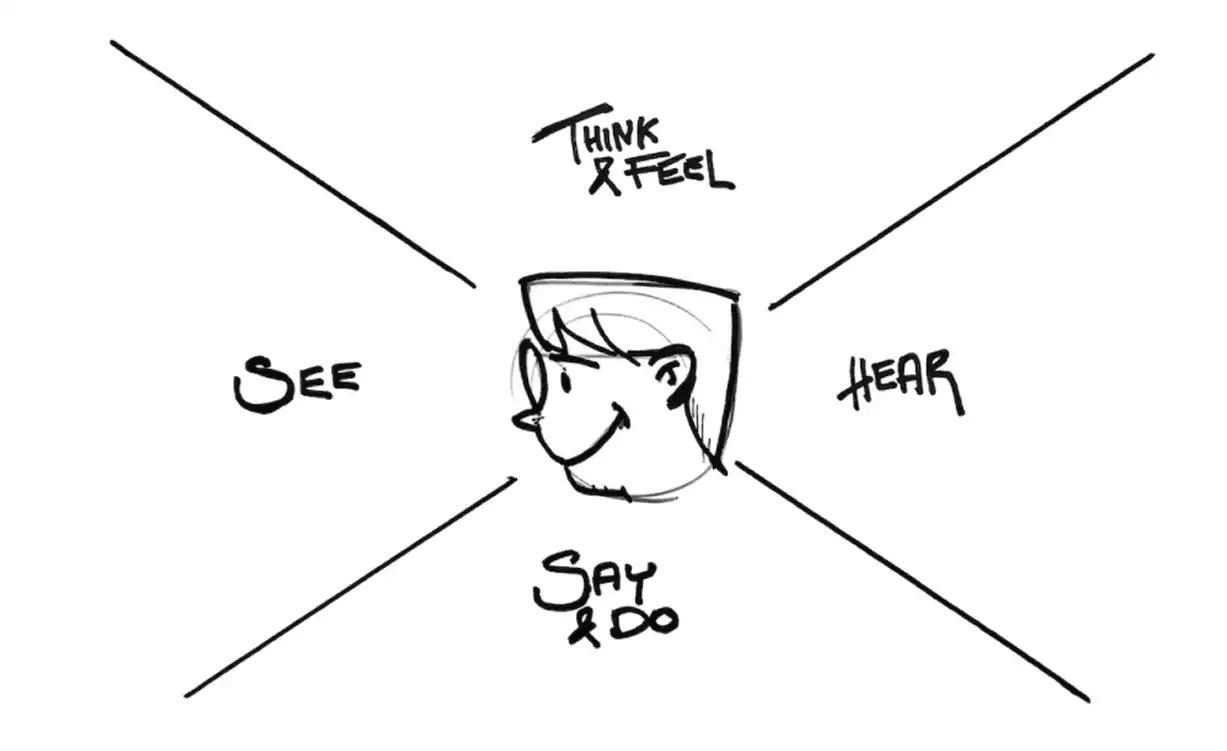
5. Gestalt Principles
The Gestalt principles come from early 20th century psychology, but they describe something so fundamental about how the human brain processes visuals that they're still as relevant as ever. The core idea: the brain doesn't see isolated elements — it instinctively groups things into patterns. As a developer, understanding this means you can design layouts that feel right to people without them knowing why.
Proximity
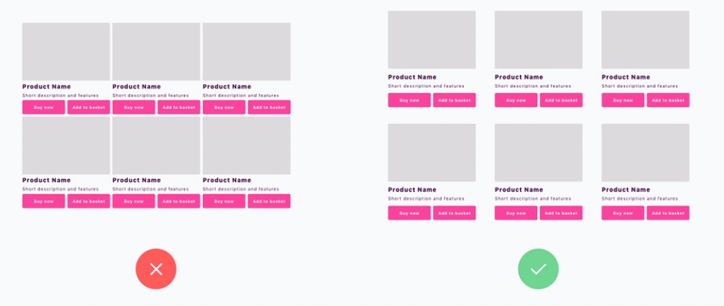
Things that are close together look like they belong together. That's it. That simple. If your form label is closer to the wrong input field, users will associate it with the wrong thing — even if they don't consciously notice. Whitespace isn't decoration. It's the tool you use to tell people what's related and what's not.

Look at the two e-commerce product grids above. On the left, the cards are too close together — there's not enough gap between them, so the brain lumps them into one visual blob instead of reading them as individual products. On the right, there's enough spacing between each card that the brain can naturally group each product on its own. Same cards, same layout — the only difference is whitespace, and it completely changes how the page reads.
Similarity
Things that look alike feel like part of the same group. If all your primary buttons look the same, users learn that pattern instantly. If you break it — same color for destructive and constructive actions, same shape for clickable and non-clickable elements — you create confusion that's hard to put a finger on but real.
 On the left, both Edit and Remove are styled as primary buttons — same color, same weight. Because they look the same, the brain groups them together and treats them as equal. That's the similarity principle working against you. On the right, Edit stays primary and Remove becomes a ghost button. Now they look different, so the brain reads them as different — one is the main action, the other is secondary. Same two buttons, but now the visual style is doing the communicating.
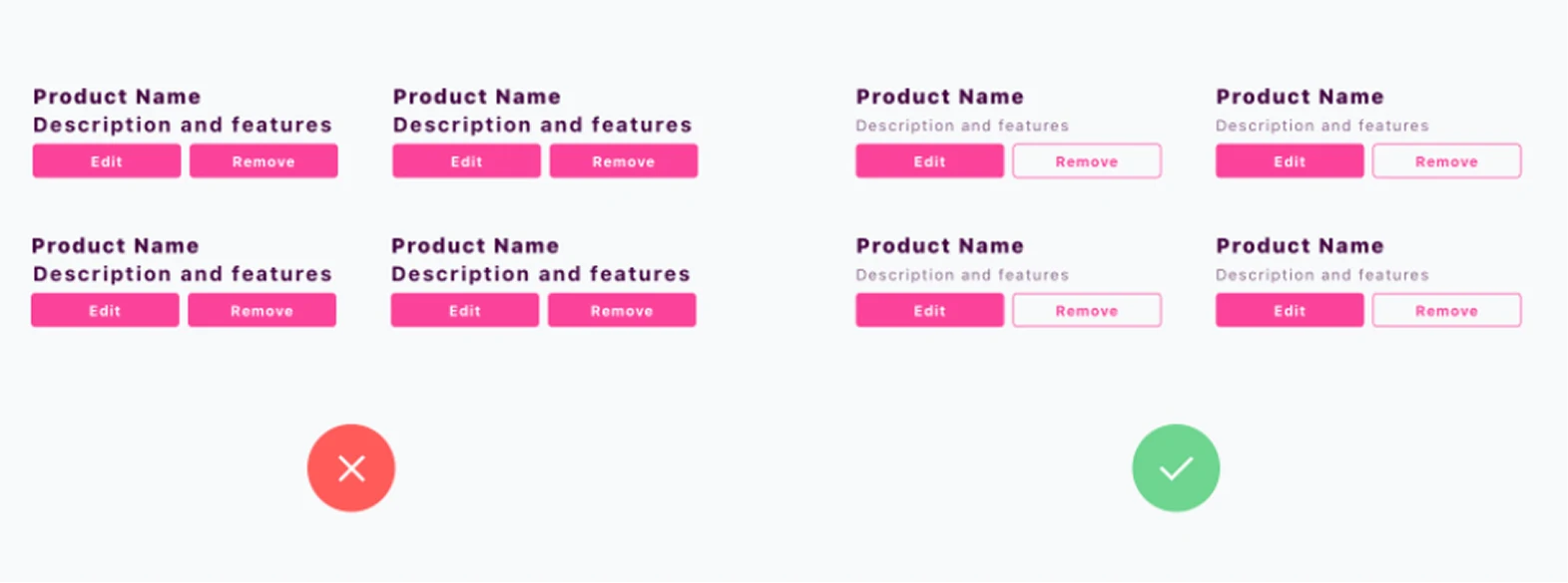
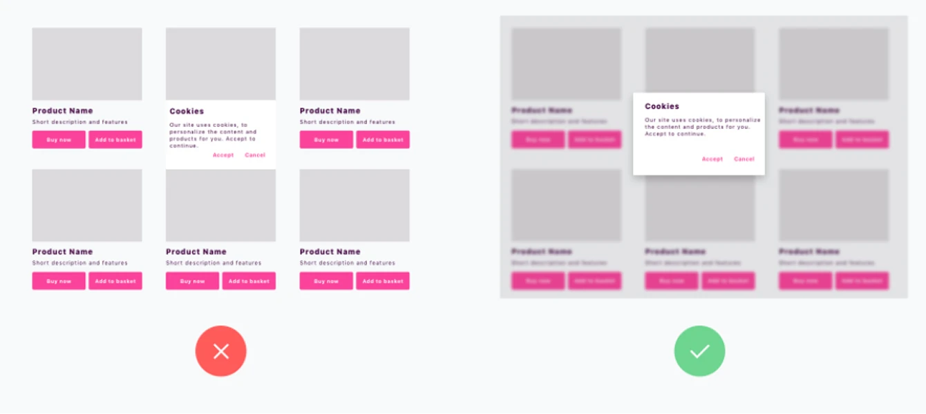
Figure-Ground
The brain always tries to separate what's in focus (the figure) from what's behind it (the ground). Modals work because of this — the overlay makes the background recede and the modal pop forward. When that separation breaks down — low contrast overlays, unclear stacking, ambiguous z-ordering — users lose track of what's interactive and what's background noise.
On the left, a cookie consent card appears on top of the product grid — but with no overlay or visual separation, the brain can't cleanly split foreground from background. It all feels like one flat surface and the card blends in. On the right, the same cookie prompt comes with a blurred, dimmed overlay behind it. Now the brain instantly knows what's in focus and what's not. The background recedes, the modal comes forward, and the user knows exactly where to look.
6. Emotional Design
People don't just use products — they feel things while using them. Every interaction lands somewhere emotionally, whether you planned for it or not. There are three layers:
- Visceral — the first split-second. Does it look good? Does it feel like something worth trusting?
- Behavioral — actually using it. Is it smooth? Does it get out of your way?
- Reflective — after the fact. How do you feel about it? Would you tell a friend?
Most products only nail the middle one. The ones people love get all three.
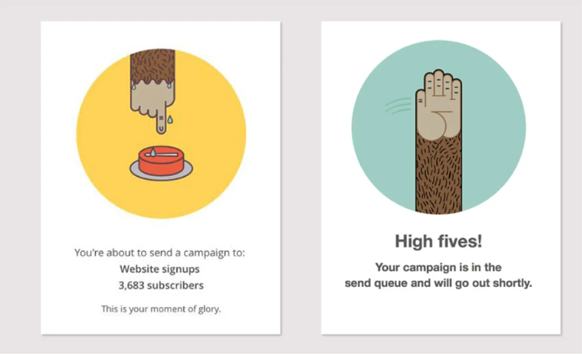
Both from Mailchimp. On the left — right before you send a campaign — you see a sweating hand. It's playful, but it also gets it: you're about to do something that matters, and the product acknowledges that without being dramatic. On the right, you've just sent. You get a high five. That's it. But that tiny moment is the kind of thing that makes people genuinely like a product — not just use it.
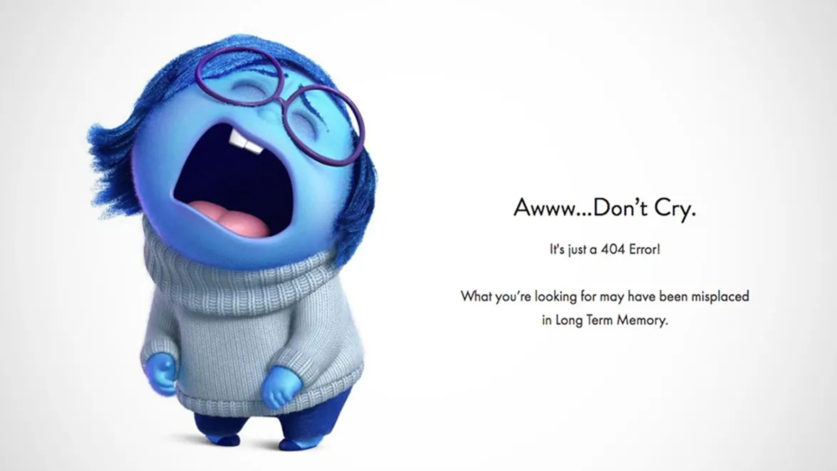
Humour works the same way. An Inside Out character crying on your error page is way more memorable than "404 Not Found." It's funny, it's human, and it makes hitting a dead end feel a lot less annoying.
Just know when to use it. If someone is already frustrated, a joke makes it worse. But if there's room for personality — lean in.
Wrapping Up
If there's one thing I want you to take from this: UX is not something that happens before you start coding. It's happening in the code, every time you make a decision about what state to show, what to call a button, how many steps a flow takes. The engineers who get this don't just write correct software — they write software people actually enjoy using.
Part 2 is coming — we'll get into UI trends, layout and typography, and accessibility. See you there.